Back to work
Identity / Luma Clinics
Luma Clinics
A full identity system for a modern clinic group balancing medical trust with a more human aesthetic.

Project scope
Luma Clinics / Wellness
The brand became easier to deploy across locations, web touchpoints, and patient-facing material without design drift.
7 sitesLocation rollout
7 sites
Location rollout
2 weeks
Team adoption
24 assets
Template library
Challenge
What needed to change.
Luma needed a brand language that felt refined and credible without slipping into cold healthcare clichés.
Approach
How the system was built.
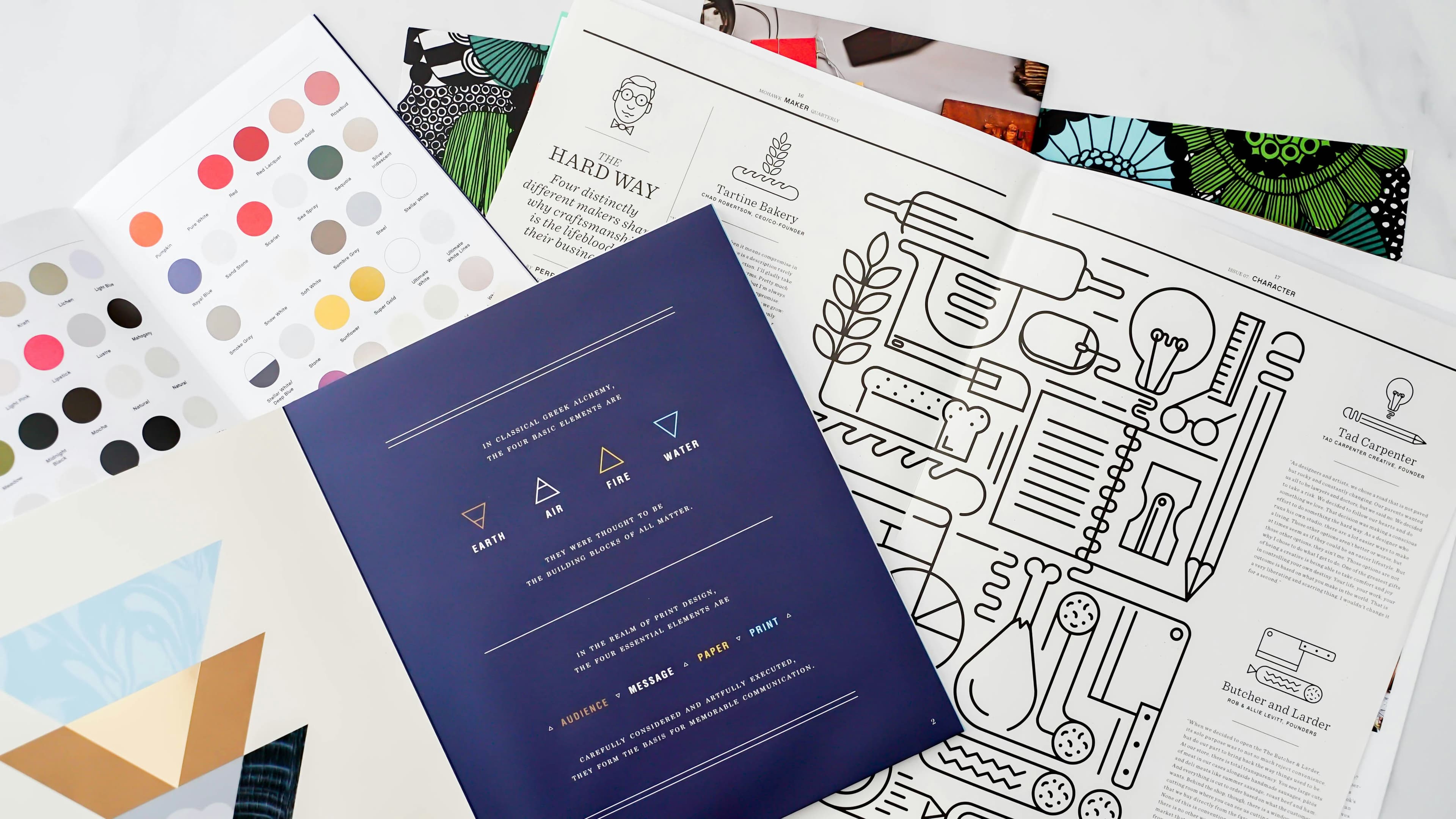
We designed a system around editorial typography, soft geometry, and a warmer content rhythm that gave the clinics a more welcoming presence.
The brand became easier to deploy across locations, web touchpoints, and patient-facing material without design drift.
Project scope
Deliverables shaped into one coherent system.
The project was not treated as isolated assets. The deliverables were designed to work as a single visual shift across launch and rollout.
Identity systemClinic signageMarketing collateralWebsite visual direction
Frame 01
Luma Clinics
Editorial grid system
Frame 02
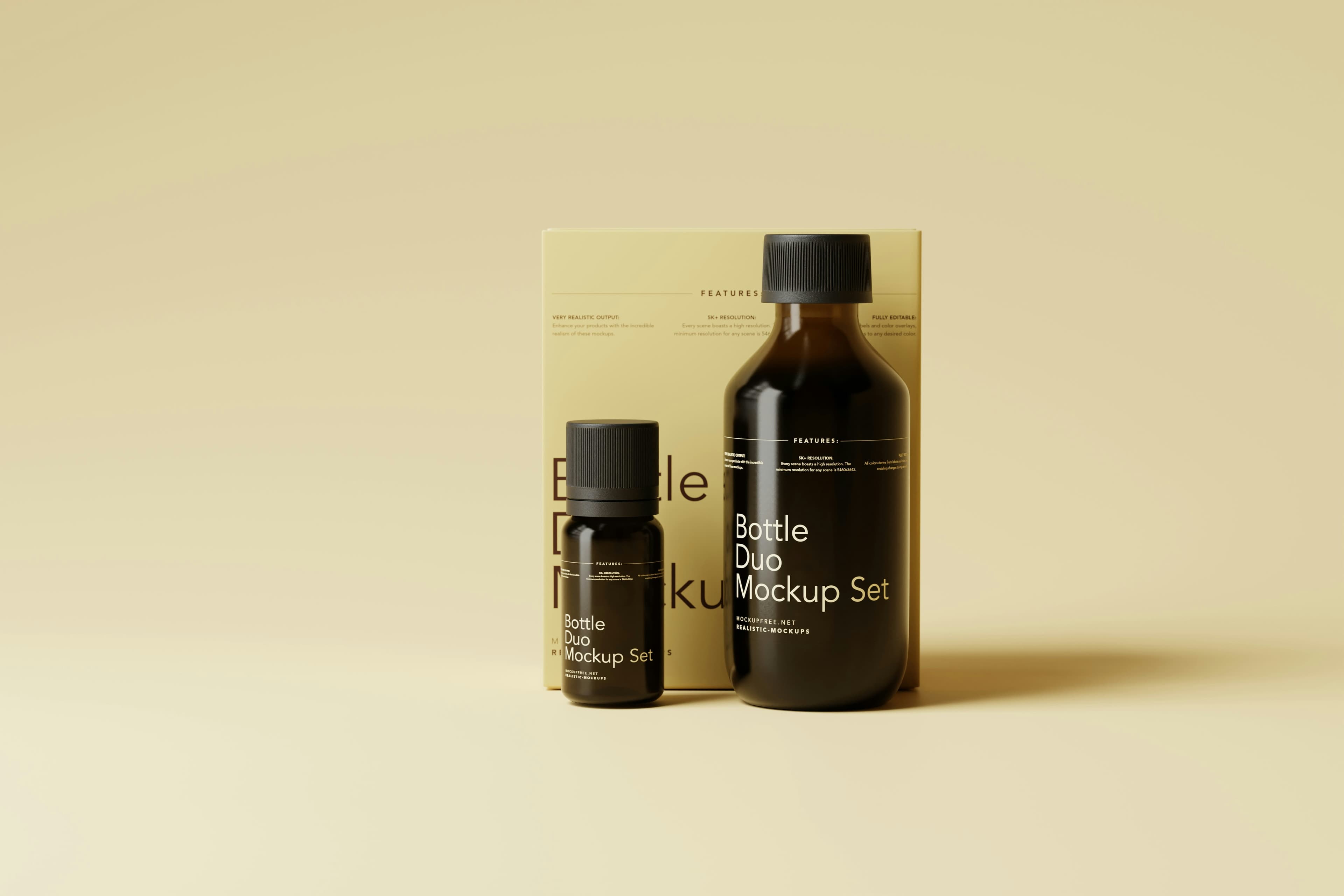
Patient welcome collateral
Frame 03
Environmental branding
More work