Back to work
Packaging / Meridian Reserve
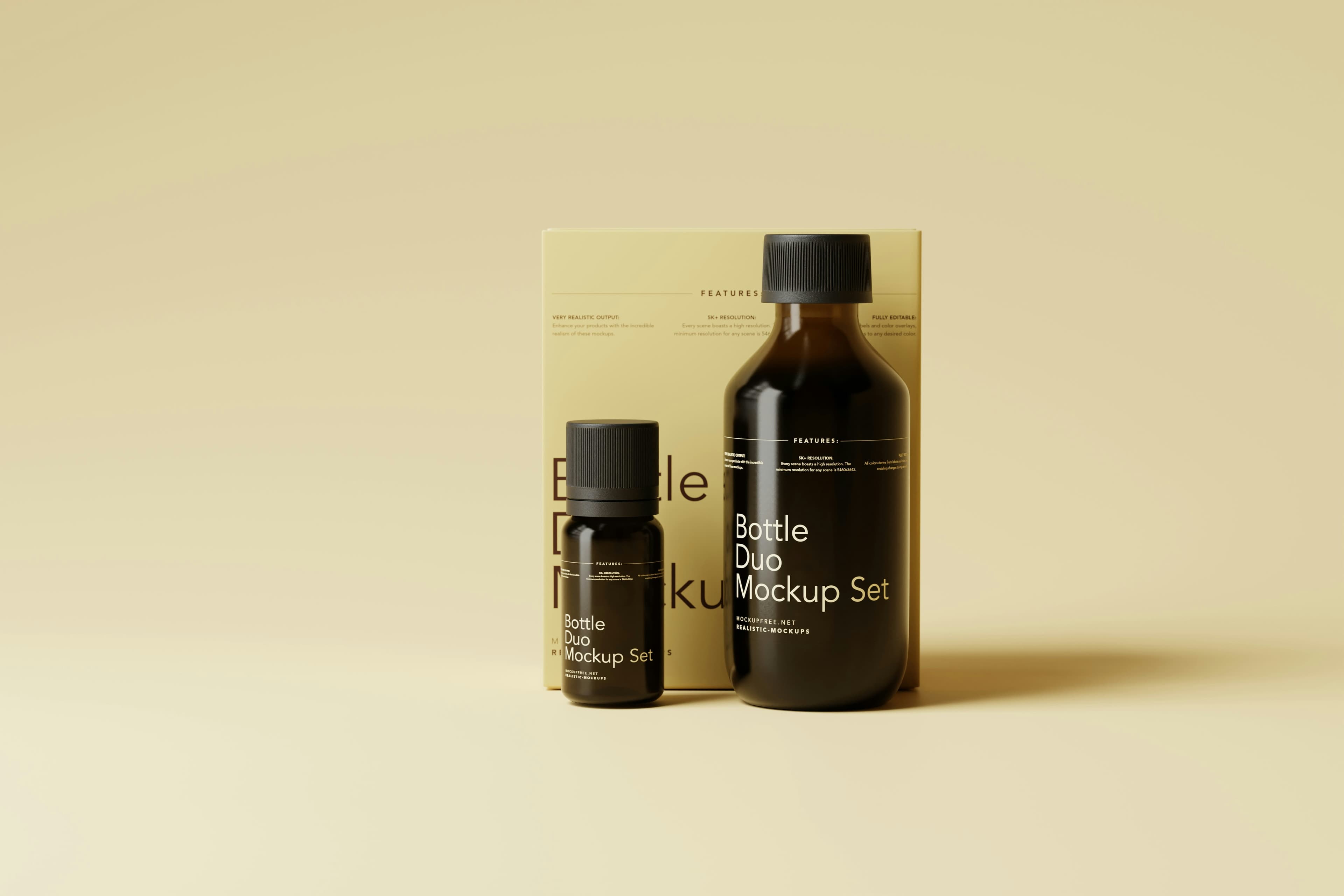
Meridian Reserve
A premium bottle and launch system that shifted Meridian from artisan brand to collector-grade shelf presence.

Project scope
Meridian Reserve / Spirits
The relaunch increased distributor confidence, created a more premium unboxing experience, and gave the team a system for future limited releases.
+31%Launch sell-through
+31%
Launch sell-through
+18%
Average order value
4 templates
New SKU readiness
Challenge
What needed to change.
Meridian had strong product quality but inconsistent packaging that blended into a crowded premium spirits category.
Approach
How the system was built.
We rebuilt the identity around restraint, tactile contrast, and a label architecture that made the product line feel singular without losing individuality.
The relaunch increased distributor confidence, created a more premium unboxing experience, and gave the team a system for future limited releases.
Project scope
Deliverables shaped into one coherent system.
The project was not treated as isolated assets. The deliverables were designed to work as a single visual shift across launch and rollout.
Identity refinementBottle label systemSecondary packagingLaunch campaign visuals
Frame 01
Meridian Reserve
Bottle silhouette study
Frame 02
Tactile label hierarchy
Frame 03
Collector launch kit
More work